
Lucas
Stenta
- Illustration
- Branding
- UI/UX

Hey Im Lucas, I am a graphic designer based in the Nation’s Capital. I specialize in Illustration and branding. When away from my desk you can find me exploring coast to coast, gaining inspiration from nature while admiring all the beautiful things that Canada has to offer.
I am generation
Presentation
Example Work
Mary Jane's Cannabis

When users visit Mary Jane’s Cannabis, they are quickly able to navigate an engaging and user friendly site. A high contrast colour pallet brings life into the site, and encourages more users to purchase their products. The overall user interface of the website is clean and sleek, which allows a strong flow throughout the entire site.
Merivale Bowling Centre logo
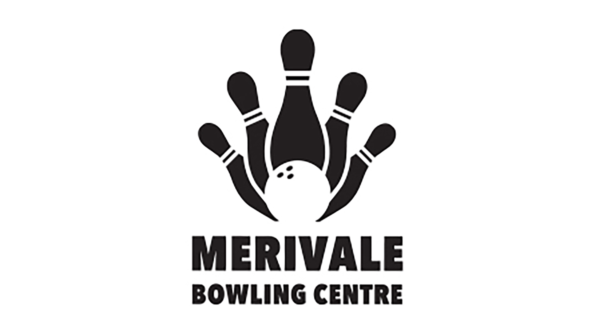
The colours chosen in this logo design were kept simple, black and white. As Merivale Bowling Centre is a glow-in-the-dark bowling alley, having a black and white logo will make their logo interact with the glow in the dark feature. For example, a white logo will glow when in a black light. Introducing a monochromatic design helps create a greater sense of professionalism than a more colourful ensemble would.
“To live a creative life, you must first lose the fear of being wrong.”
Digital portraits
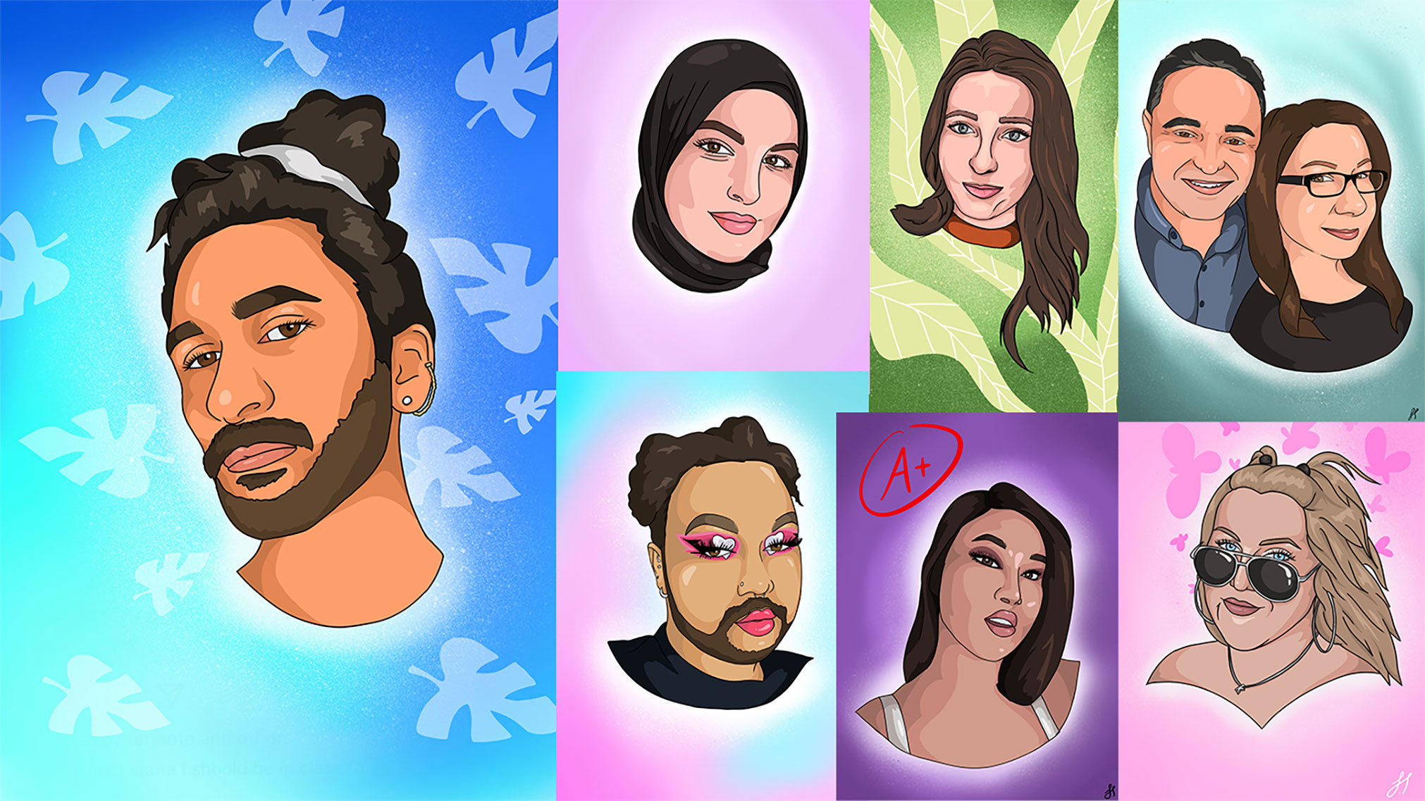
Through years of drawing on many different mediums I’ve adapted a unique illustration style. Its a cross between a caricature and a cartoon animation.
Fruit by the foot package design
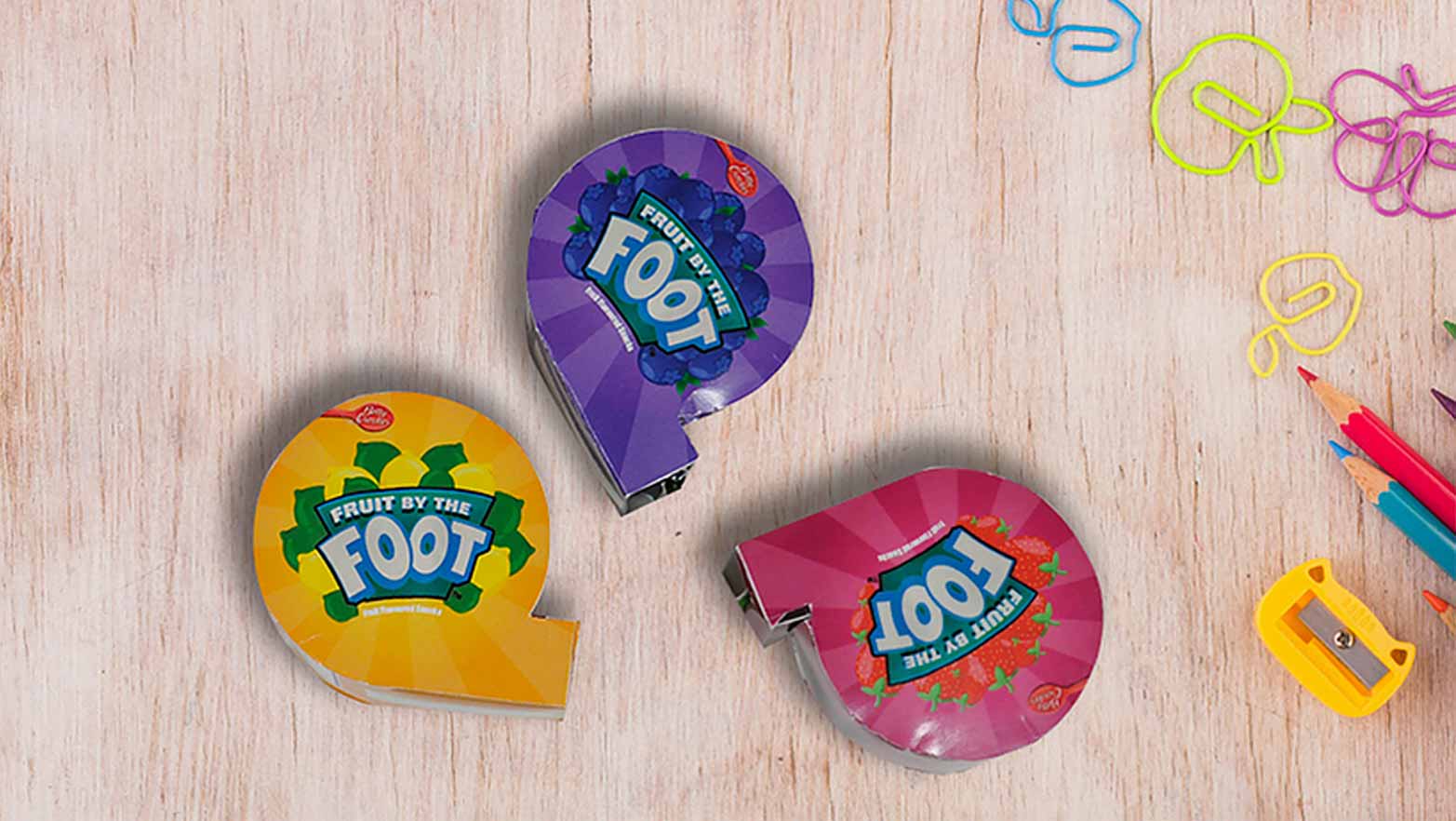
I came up with one cohesive layout with three variations which was dependent on the flavor. This repackaging design will be beneficial for the target audience, as it combines both vibrant colours and an element of entertainment. After the children are done with their snack, they have a toy tape measure that was included in the design. In addition to this, the packaging was printed in a vegetable ink and made of 100% recyclable material.