
Hannah
Reed
- Branding
- Illustration

Hey it's Hannah! My passions lie in Branding, Print and Illustration Design. I like to be challenged and solve problems in order to bring success to the company I am working for. I like to try new things and explore through the world of design. Also, Pineapples are kind of my thing!
I am generation
Experimentation
“Design is so simple, that's why it is so complicated. Remember that.”
Example Work
AmbCanada
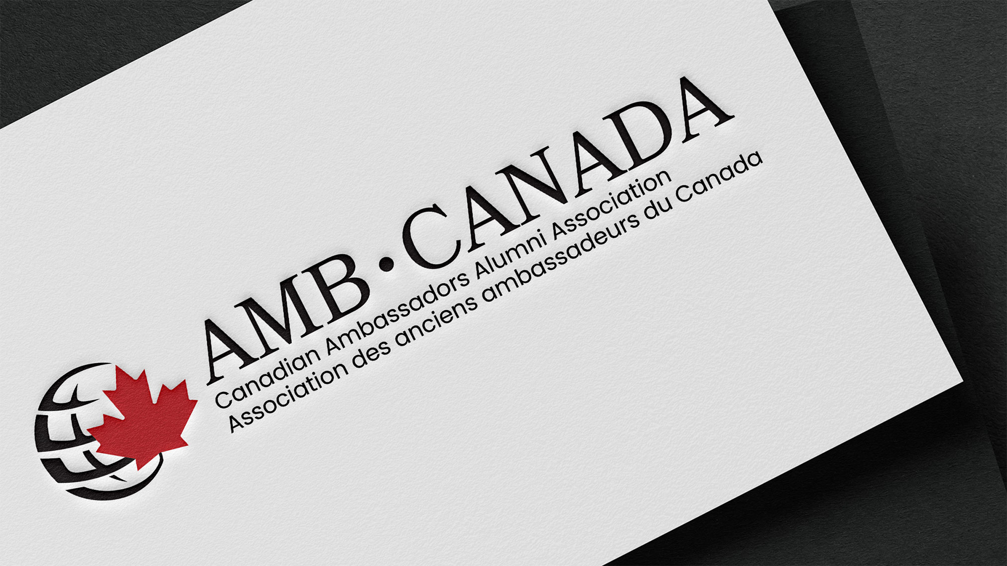
This logo was to represent a Canadian Diplomacy Organization that was going international. They asked for 3 signature icons in the logo: a maple leaf, a bridge and a globe. They wanted a modern and simple logo.
Cash Canuck
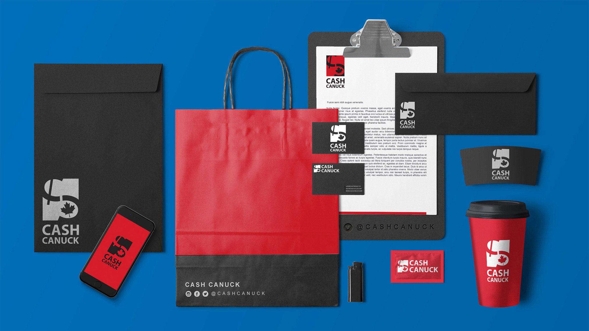
Cash Canuck is a small Canadian business that recently started. The client wanted Canada represented in the logo with two C's. Although that is very common and used world wide, it was a fun and creative adventure designing it.
Sonshine's Doghouse Creations
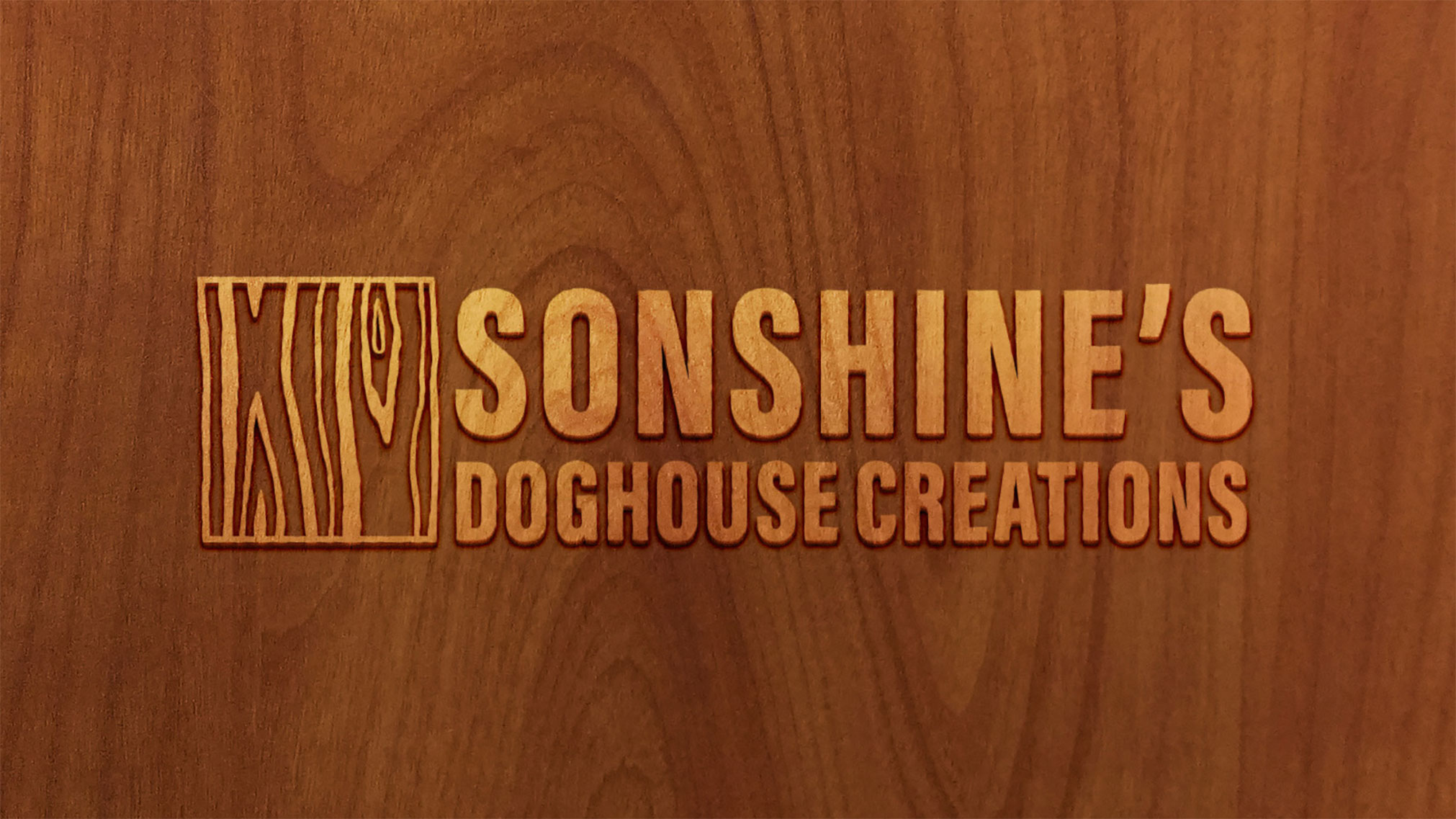
The name of the company is not quite what the company represents. It is actually a custom pen business and he works out of a workshop he built himself. The name comes from his father and grandfather who started the business and his wife calls his workshop the “Doghouse”. It shows that I am able to overcome difficult challenges and still be able to make the client happy.
Rawdon Creek Soap Co.
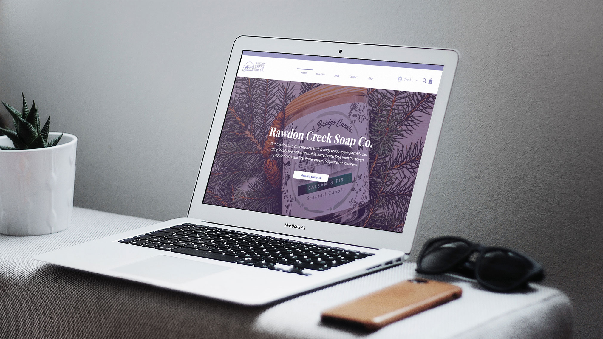
I was fortunate enough to work on the re-brand and website and make the company more modernized and fresh, in order to keep their natural, organic feel. The logo is a simplified illustration of the cover bridge that is located in Rawdon. They wanted to keep their hometown apart of the brand to remember how it began.